Austrack Campers
Austrack Campers came to us wanting a new website. As this is a 100k+ & around 6 month project we gave them another option - A full research audit then design, develop & launch key pages of the purchasing journey. The benefit? See the ROI benefit sooner for a reduced cost.
Leadership
CX Research
UX/UI Design
AB Testing

Research Quantitative & Qualitative
Always start with the research
Between the research & data team, we ran 12 quantitative & qualitative tactics. Gaining a wealth of customer insights as a foundation.
GA4 Audit
Tech Audit
Baseline Data Analysis
User Journey Analysis
UX/UI Review
Customer Survey
Usability Studies
Information Architecture
Competitor Review
Session Recordings
Search & Merch Review
Conversion Review
Key Opportunities Identified
Four themes were highlighted by customers throughout the research. Identifying clear areas for opportunity.
Gaps in Trust & Value Reassurance
Austrack have been in the industry for 15 years & their campers come with additional features as standard however they do not utilise this information anywhere currently on the website.
Lack of storytelling & emotional connection
People don't just buy a camper van; they buy into a lifestyle. The website wasn't reflecting that. Missing lifestyle imagery, real customer stories, and copy that sells the dream.
Unclear path to conversion
Austrack currently showcases multiple CTA's in their navigation leading users to confusion on what they need to do to move forward.
Lack of guided selling & personalisation
The browsing experience had its own hurdles. Users struggled to explore without a clear understanding of camper types, navigational imagery was lacking, product cards weren't doing enough, and there was no guided selling journey to help users narrow down options based on their needs.
Optimisation 1
Design Navigation
Problem
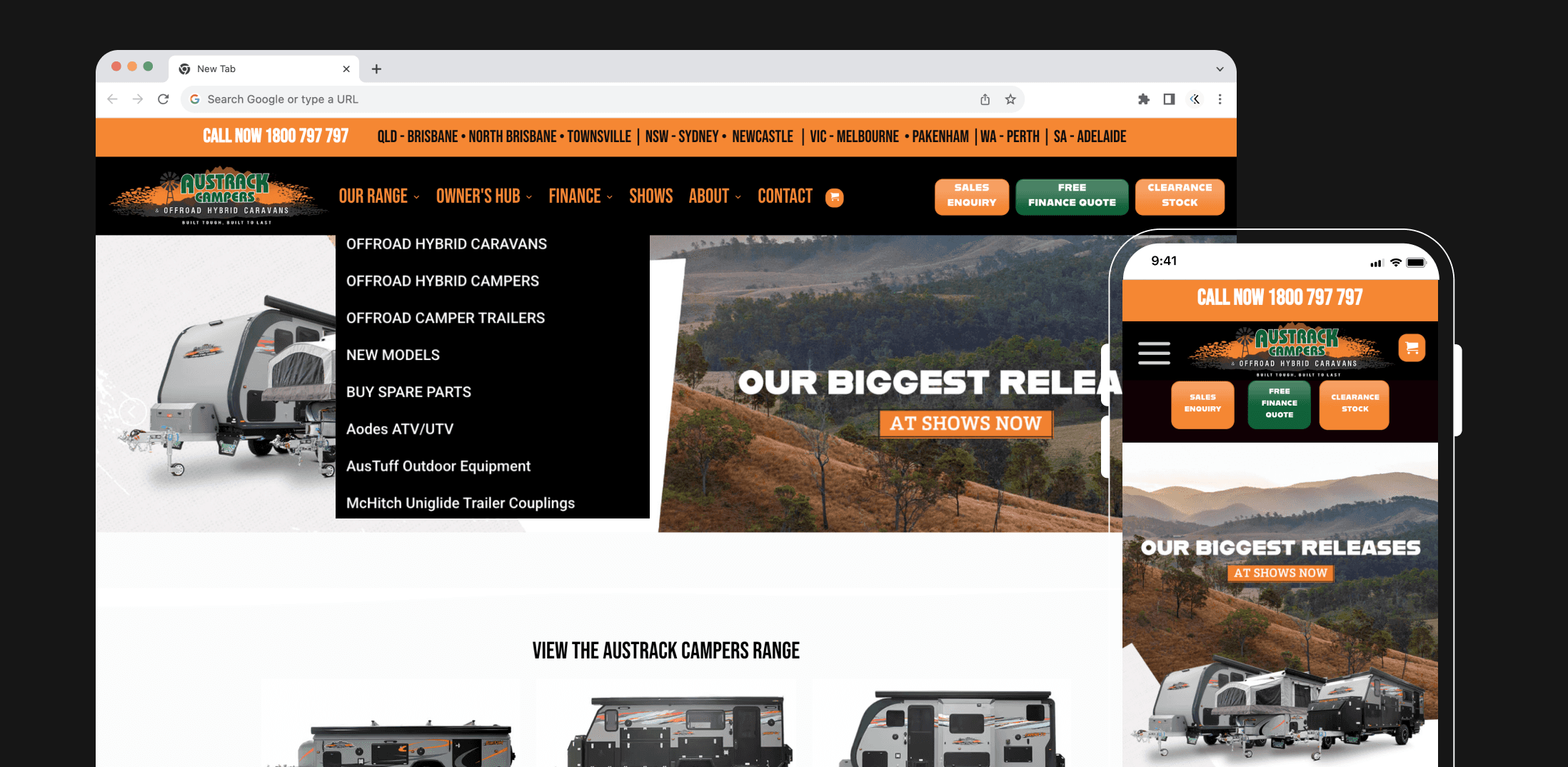
Whilst undergoing Usability Studies and Information Architecture studies, it was highlighted how limiting the current menu navigation was.
Key Pain Points Identified
Conversion Path Confusion
The main issue in the navigation which was highlighted numerous times throughout the research phase was the three primary CTAs. These created confusion for users who did not know the clear next steps in the purchasing journey.
Guided Selling
Another key barrier was the need to choose between three camper types without any supporting descriptions or visual cues to explain the differences.
UX/UI Violations
The research surfaced several additional pain points & UX/UI violations, including the locations banner, which users perceived as clickable while it's positioning adding additional cognitive load.
There were also multiple navigation links that directed users off-site, creating a clear barrier to conversion.
Existing Navigation Design
Solution
The navigation was tested in two stages. The first state focused on the IA, with variations of primary CTAs being the main difference.
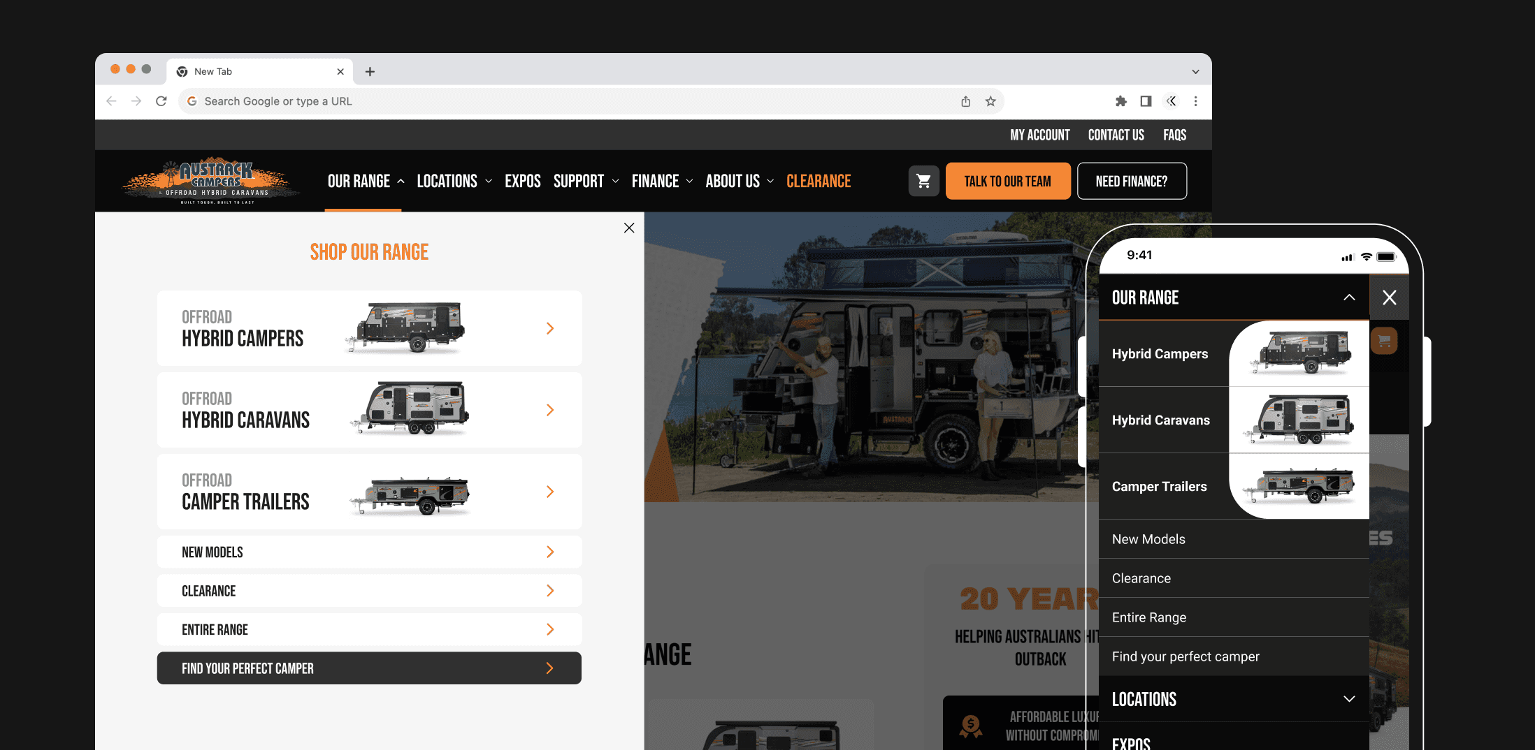
Once we had a winning IA, an alternative navigation design was tested. Creating a large, drop down navigation with improved hierarchy of categories & of course - images of camper types.
Key Pain Points Identified
Conversion Path Confusion
Variations of primary CTAs were tested to see which improved conversions.
Guided Selling
Images of the camper types were included in the drop down navigation to visually aid product selection.
A link was added to promote the guided selling tool for users experiencing anxiety over which product was right for them. This tool asked a series of questions to narrow the selection down to three relevant options.
UX/UI Violations
Locations were repositioned into a dropdown category, reducing navigation height and visual clutter while improving usability by allowing users to easily access individual location pages.
Other areas of the navigation were refined—links were renamed, tidied, and, where they led externally, either removed or moved into the footer.
A larger dropdown interface and a transparent overlay outside the menu were also introduced to better guide focus and reduce distraction.
Contact Us Uplift
Primary Metric | 99% Significance
Bounce Rate
Secondary Metric | 98% Significance
Sales Enquiry Clicks
Monitoring Metric | 86% Significance
Optimisation 2
Design Product Listing Page
Problem
The product listing page was identified in user journeys as a key opportunity due to high levels of direct traffic that resulted in high bounce rates.
When reviewing the page, there were many areas of opportunity identified to improve the customer experience which aligned to the themes identified in the research phase.
Key Pain Points Identified
Product Cards & Guidance
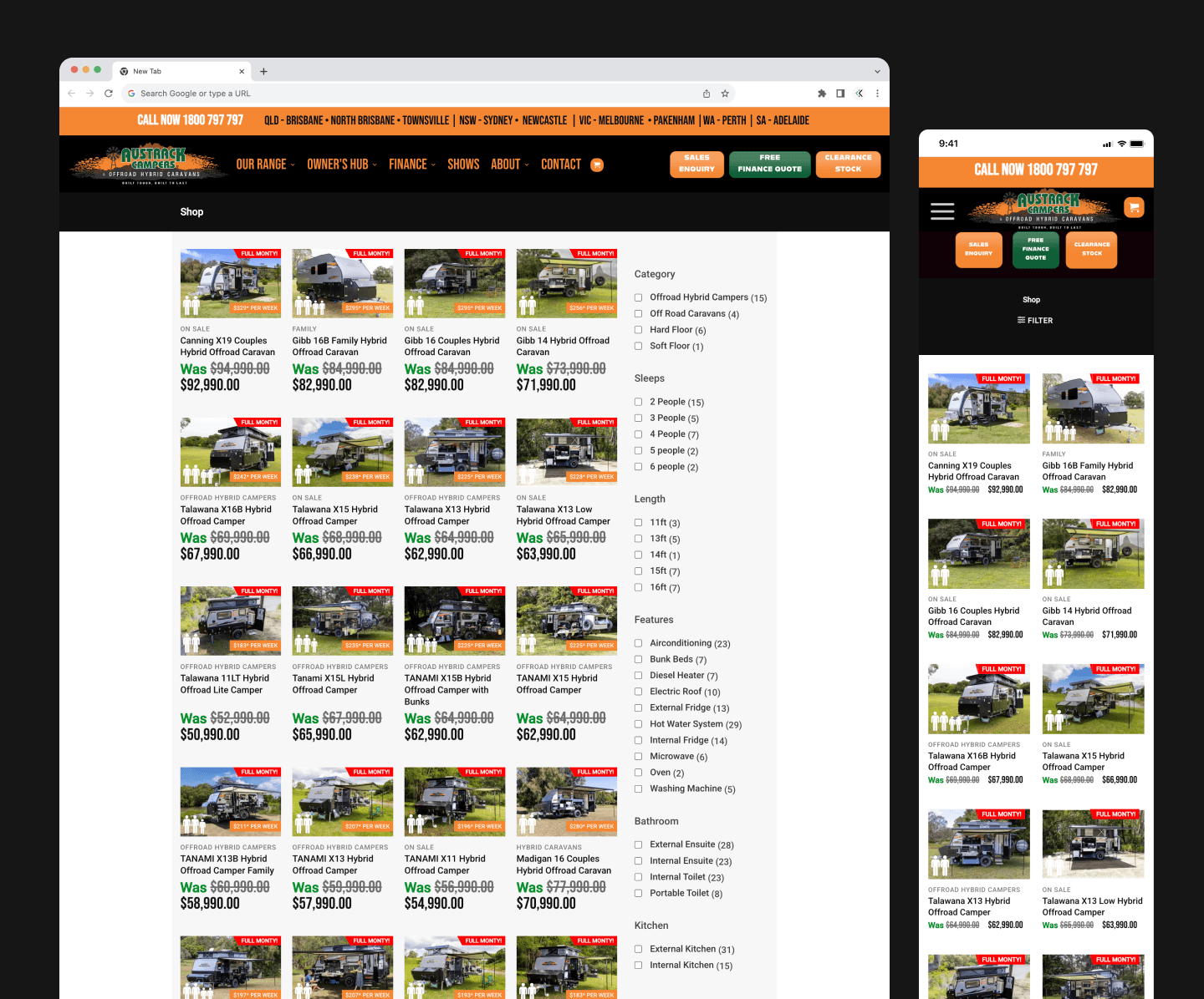
Product cards did little to aid product selection with key elements missing or shown as icons embedding into the image. Relying on the user to interpret these correctly.
Product cards on the page were small with icons & labels embedded over the image. This did little to bring the product to life, and there is solid UX evidence that larger, clearer product imagery increases perceived quality and desirability.
There was also no tool other than filters promoted to guide users to the right products for their specific needs.
Filter Engagement
Filter engagement was low, partly due to its right-hand placement on desktop, making it easy to miss within typical F-pattern scanning behaviour.
On mobile, the filter CTA also lacked prominence—positioned in the header at just 12px with a 16px touch target, falling well below accessibility guidelines.
Conversion Path
While the product card was clickable and navigated users to the PDP, there was no CTAs on the card to prompt users to take action or give them another option of action.
Page Header
There was no page hero to aid storytelling, create inspiration, as well as improve SEO. Users were not reminded which category they were on.
Existing PLP Design
Solution
Test an optimised PLP experience that resolved the key pain points identified.
Key Pain Points Resolved
Product Cards & Guidance
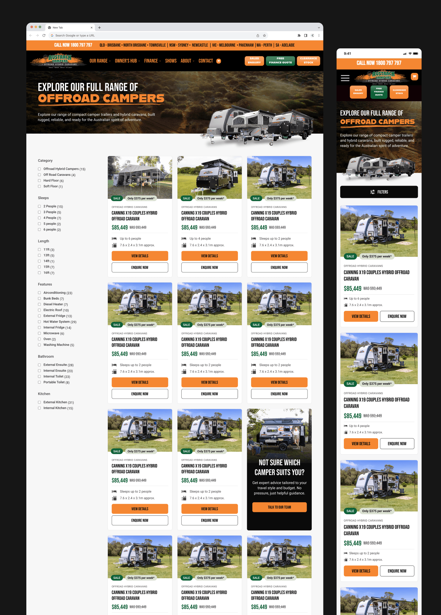
Product cards were redesigned and resized, shifting from four to three per row on desktop and two to one on mobile. This allowed for larger imagery and the inclusion of key information previously missing, such as size and sleep number details.
An in-grid tile was introduced after every eight products to promote the guided selling tool for users experiencing decision fatigue. This tool asked a series of questions to narrow the selection down to three relevant options.
Filter Engagement
On desktop, the filter was repositioned to the left-hand side of the page.
On mobile, a large, prominent, and accessible 48px-high button was introduced, separated from the dark header for greater visibility.
Further filter enhancements were deferred to a later iteration to first validate the impact of the positioning changes.
Conversion Path
Two CTAs were included on the product card, clearly signalling that the card was clickable while also offering a secondary option to download the brochure.
Page Header
A page header was designed to bring the page to life while also including SEO copy.
PLP to PDP Progession
Primary Metric | 98% Significance
Brochure Downloads
Secondary Metric | 99% Significance
Bounce Rate
Monitoring Metric | 99% Significance
Optimisation 3
Design Product Display Page
Problem
Currently, the PDP does not enable users to quickly understand key product features, which may limit their perception of the caravan’s overall value.
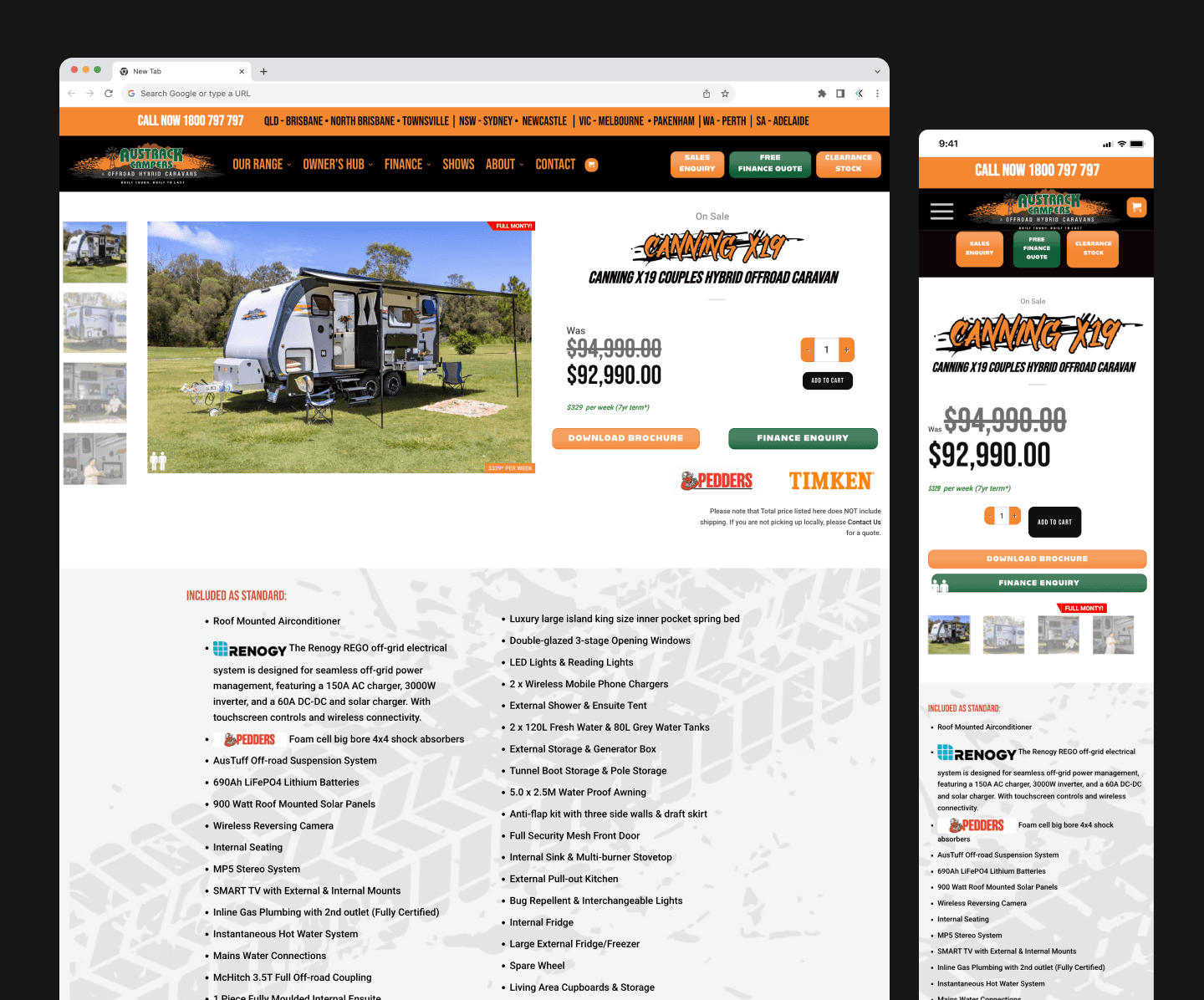
While many features are available within the product gallery and further down the page, users landing on the PDP must scroll and explore extensively to uncover core benefits such as sleeping arrangements and the electric roof, rather than grasping them at a glance.
Key Pain Points Identified
Image Gallery
On mobile, the image gallery is minimal, with no large default image shown unless the user chooses to zoom in.
Across both mobile and desktop, the absence of clear pagination, number of images messaging or zoom icons reduces user engagement with the gallery.
Product Information
Above the fold, limited product information is shown, offering no additional context beyond what users have already seen on the PLP. This creates a disconnect and makes inefficient use of valuable space, contributing to higher bounce rates.
Below the fold, specifications and inclusions lack clear formatting and hierarchy, with all features given equal visual weight. This increases cognitive load and makes it harder for users to quickly digest key information.
Conversion Pathways
The PDP did not effectively guide users toward the most relevant CTA options based on their needs.
Additionally, the UI failed to meet colour contrast requirements, impacting accessibility and readability.
In-page Navigation
Users were unable to explore & navigate to specific areas of interest throughout the long page due to a lack of in-page navigation.
Existing PDP Design
Solution
The PDP was optimised across two iterations. The first focused on above-the-fold improvements to address key identified pain points.
The second iteration targeted a redesign of the specifications and inclusions sections.
Running the work in two stages enabled faster insight generation and ensured results could be accurately attributed to specific changes.
Key Pain Points Identified
Image Gallery
On mobile, the image gallery has been moved higher up the page so it’s visible on initial load, helping break up content from the navigation.
A zoom icon and a more compact pagination system have also been introduced. The subtle preview of the next image encourages users to continue scrolling through additional visuals.
On desktop, the gallery has been designed to surface larger image previews without requiring interaction, showcasing the camper in different lifestyle contexts to increase engagement.
Product Information
Above the fold, key features were surfaced with a “view all” link directing users to the full component below. The number of free inclusions was also highlighted with an orange background to emphasise the added value of Austrack campers.
Below the fold, specifications and inclusions were redesigned to prioritise the most important items. An “Included as standard” section was introduced, making it clear which Austrack features come as part of the base offering.
Conversion Pathways
Two CTAs were defined as primary and secondary, while additional options were reframed as questions to better surface and address user needs.
All CTAs and interface elements across the page were also redesigned to meet AA colour contrast requirements.
In-page Navigation
In-page navigation was introduced. This was positioned below the image gallery and became fixed as the user scrolled past it. It allowed the user to interpret all the page content, then navigate to components of interest.
Bounce Rate
Primary Metric | 99% Significance
Sales Enquiry
Secondary Metric | 99% Significance
Brochure Download
Monitoring Metric | Inconclusive